top of page
WHY IT MATTERS
Planning without analysis means deciding without evidence.
-
No visibility into where passengers actually travel and when demand peaks
-
Overloaded routes and service gaps go undetected until they become operational problems
-
Planning decisions based on assumptions rather than real network behavior
-
Optimization built on incomplete data produces incomplete results
HOW IT WORKS
From raw operational data to clear mobility insgihts
01
Connect your data sources
Cermoni analyzes smart card data, trip information, route structures, stop sequences, vehicle movements, and timetable records to build a complete picture of how passengers and vehicles move across the city.
02
Reveal demand patterns and service gaps
The system estimates occupancy levels, identifies origin-destination patterns, analyzes transfer points, and compares planned service with observed operational data — at stop, trip, vehicle, route, and region level.
03
See where and why problems occur
Results are presented through maps, charts, and operational views — so planners can understand network behavior directly, not just through tables and numbers.
KEY CAPABILITIES
Everything you need to plan smarter
.png)
.png)
Occupancy Analysis
See exactly how loaded each trip is — stop by stop
Cermoni estimates how many passengers are inside each vehicle between stops throughout a trip. This reveals where buses become crowded, where comfort levels drop, and which segments of a route need closer attention — going beyond simple boarding counts.
Estimates passenger load between every stop on a trip
Identifies where capacity problems appear along the route
Shows the full profile of each trip, not just totals
Origin-Destination and Transfer Analysis
Understand where passengers come from and where the go
Cermoni analyzes passenger journey patterns — commuting, trips, peak-hour movements — and identifies the transfer points where passengers switch between services. These interchange locations are often critical for network performance and can be prioritized for service improvements.
Maps where passengers start-end their journeys across network
Identifies key transfer points ans interchange behavior
Highlights regular mobility patterns like commuting,school trips
.png)
.png)
.png)
.png)
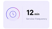
Visual Network Intelligence
Complex network data made easy to interpret
Cermoni visualizes route performance, occupancy levels, service frequency, and route relationships across the network on maps, charts, and operational views. Planners can see how lines interact, when trips become crowded, and how service levels shift throughout the day.
Route performance and occupancy visualized across full network
Maps and charts replace tables for faster interpretation
Shows how different lines interact and where service levels change
REFERENCES
What teams achieve with Cermoni
Real results from transport authorities and operators who shifted from manuel to digital public transportation planning.
See how cities use Cermoni to turn data into better operations.
Read all the case studies
bottom of page